Improved tapered rivers in QGIS
(versión en español aquí
)
Here's a way of making maps of river systems in QGIS that represent in a much more realistic way the characteristics of a watershed, showing the rank of each river and creek with stroke widths and using tapered lines. Watersheds drawn in this way represent much better the relative flows of streams and add an additional graphic element to show the direction of flow of water bodies.
This is an improvement of the method proposed by Anita Graser (author of “QGIS map design”) in her blog.
You will of course need a decent river data set. In my case I have used the rivers from the new 1:25,000 maps of the Panamanian geographic instituteThe Instituto Geográfico Nacional Tommy Guardia”, IGNTG. The IGNTG has not released the data layers of the new maps, so I have been forced to digitize the rivers on top of a georeferenced PDF like this one:
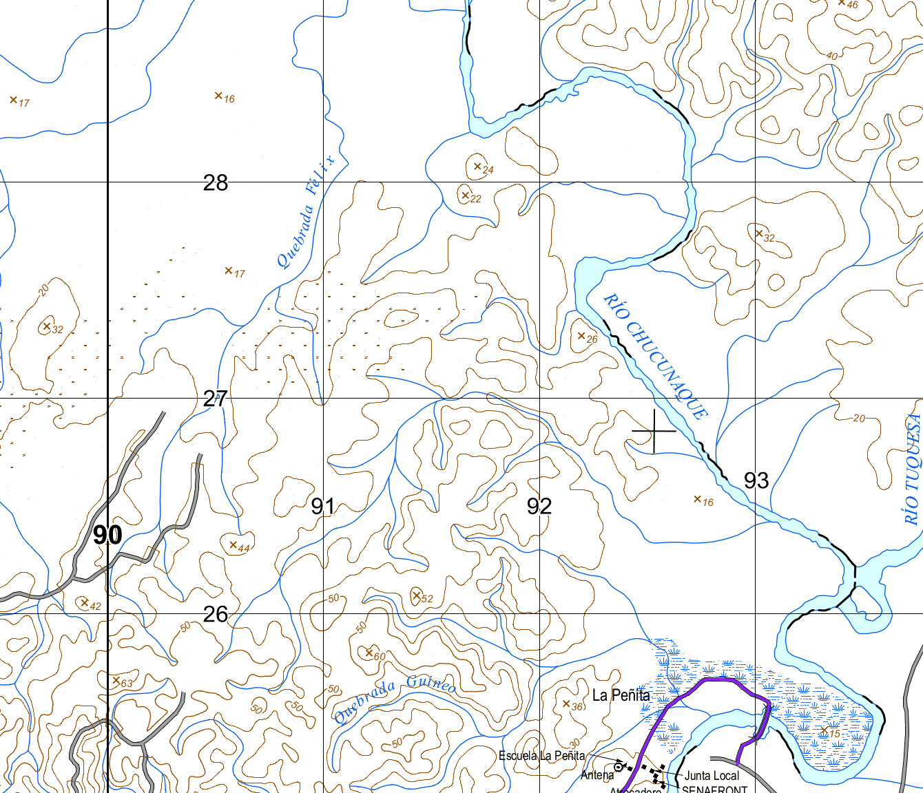
You can also do this with satellite or drone images. Make sure your data meets some minimal criteria:
- Each river and creek must be on a single feature. If the river is made up of more than one line, you must join these lines in order to end up with a single one. I won't go into details here but you can try to do this by selecting all your segments and using Vector/Geoprocessing tools/Dissolve. The map shown here has this problem in one of the rivers, let's see if you can spot it.
- The line should be drawn from the source to the mouth, meaning in a downstream direction. Or at least all in the same direction. The line direction is important for the algorithm used here to know where to start plotting the thinnest part of the line and the gradual thickening of the stream. When you have a river that looks like the image here
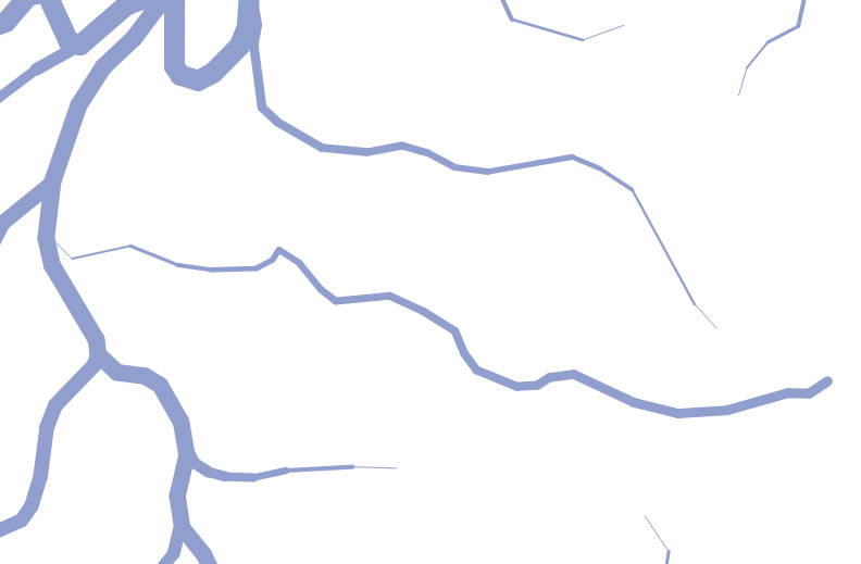 This creek's direction needs to be fixed, fix it by selecting your river and clicking on Reverse line in the Advanced digitizing toolbar.
 - You must include in your attribute table a column that represents the rank of each stream. In the example layer in here, this field is called
"AA_ORDEN". The largest rivers are have the order 0, those that drain into the largest rivers are 1 and so on. I used 6 levels, 0 to 5, number 5 is for the smallest creeks. You can see the numbers I used for streams on my map here: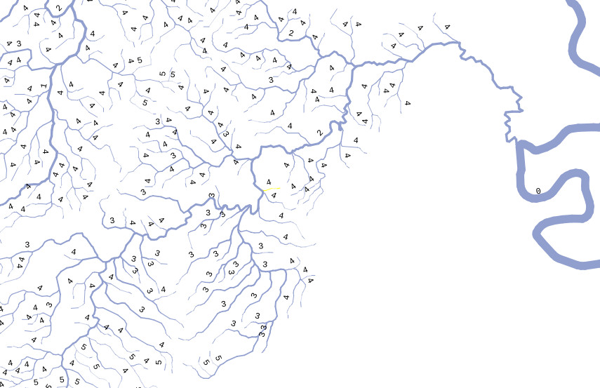 You can come up with your own classification system: 'large river', 'small stream', 'mid-size river' or whatever you want.
You may want to adjust these values by trial and error based on how it looks.
You can come up with your own classification system: 'large river', 'small stream', 'mid-size river' or whatever you want.
You may want to adjust these values by trial and error based on how it looks. - Depending on the scale of your map, you should include as many nodes as possible on each line. The more detail you add to your streams the better it will look, since the code thickens the line segment by segment.
- You may want to add a column with the name of the watershed the stream belongs to. With this you will have the option of showing a specific watershed on your map using different colors or showing all the streams in your watershed of interest and only the largest ones in the other watersheds.
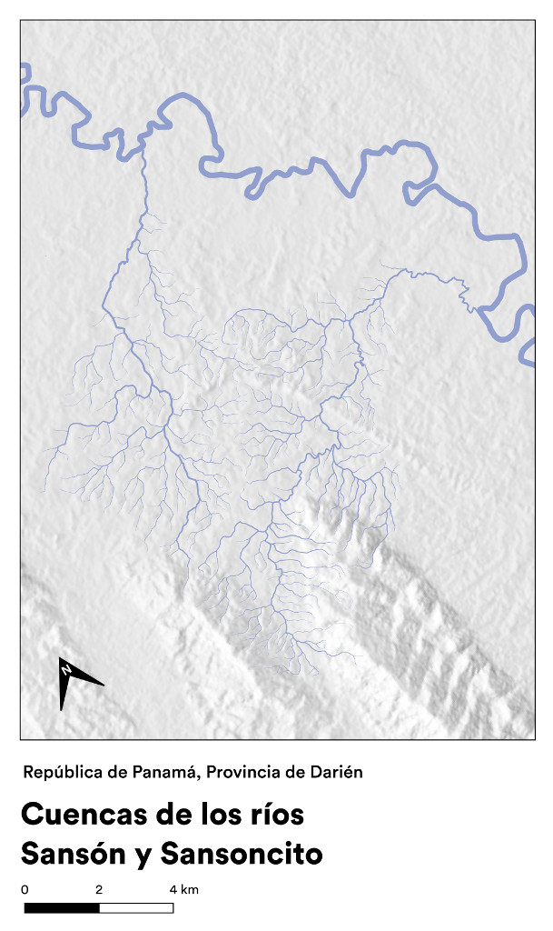
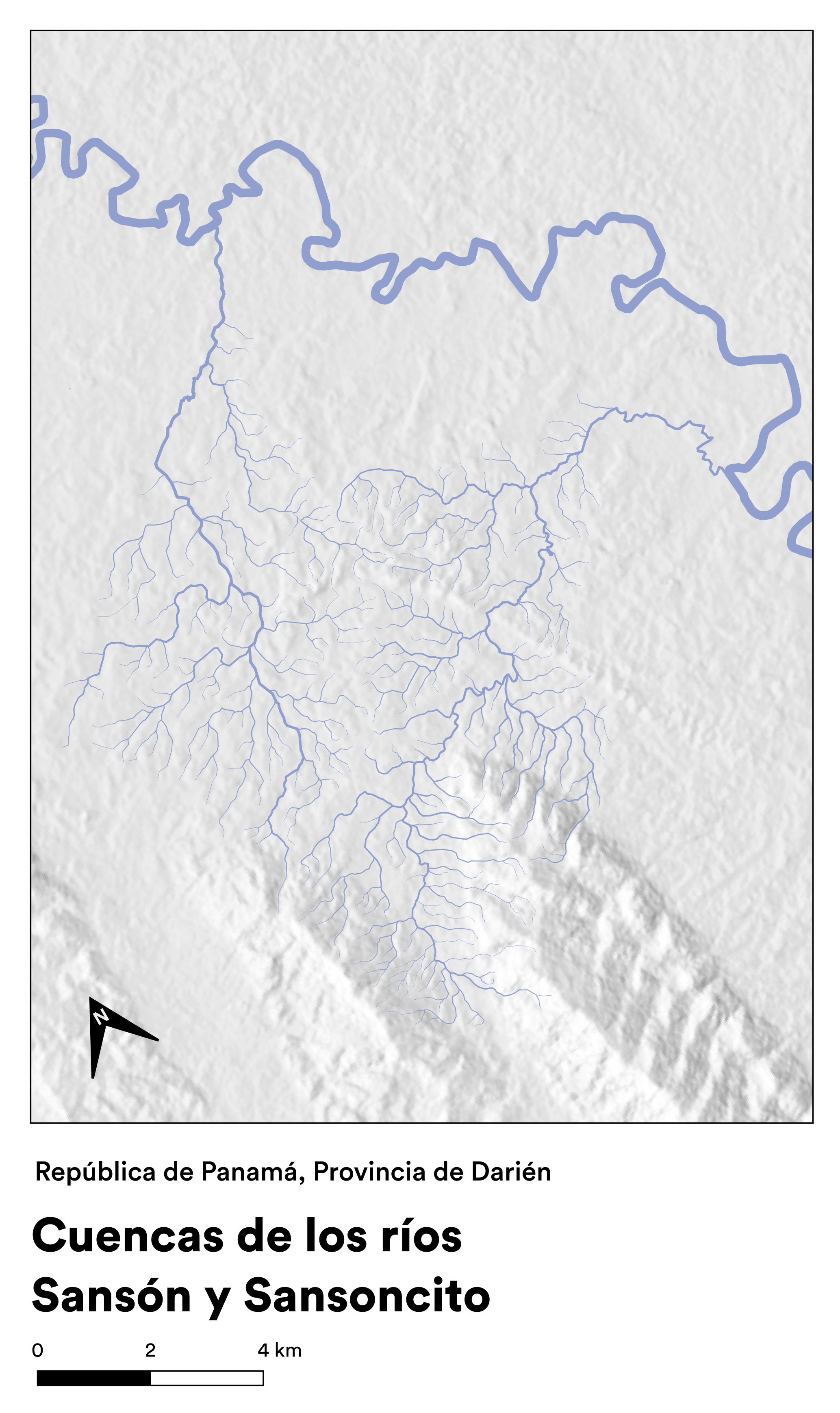
I include here a sample dataset you can use for experimenting. It includes the streams of the Sansón and Sansoncito watersheds in the Darien Province in Panama. The CRS is WGS 84/UTM 18N (EPSG 32618).
Download the sample dataset here in geopackage or shapefile format.
Once you have your rivers dataset we are ready to begin.
Note: this method uses quite a bit of CPU, especially with longer rivers and if your dataset is large and detailed. If you are using QGIS in an underpowered computer, be ready for it to get warm and maybe take a long time to render your streams.It is a good idea to make a duplicate layer with simple symbology to visualize your data quickly and only show your tapered river later when necessary.
- Add your layer.
- From the Layer properties/Symbology dialog, add a Geometry generator symbol layer with the Geometry type Linestring/MultiLinestring. In the box for the expression type
segments_to_lines($geometry)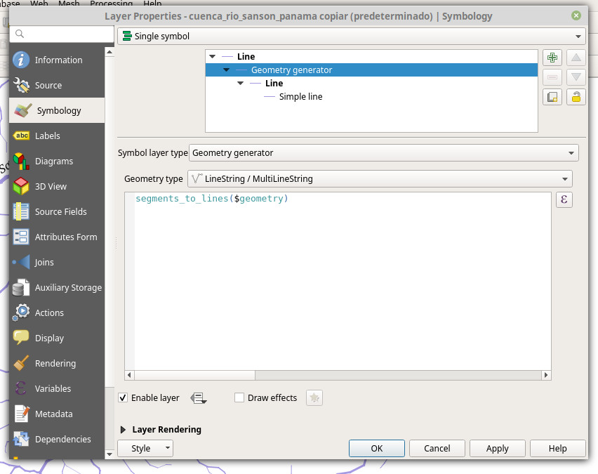
- Select the Simple line layer in the same dialog and choose your stroke color.
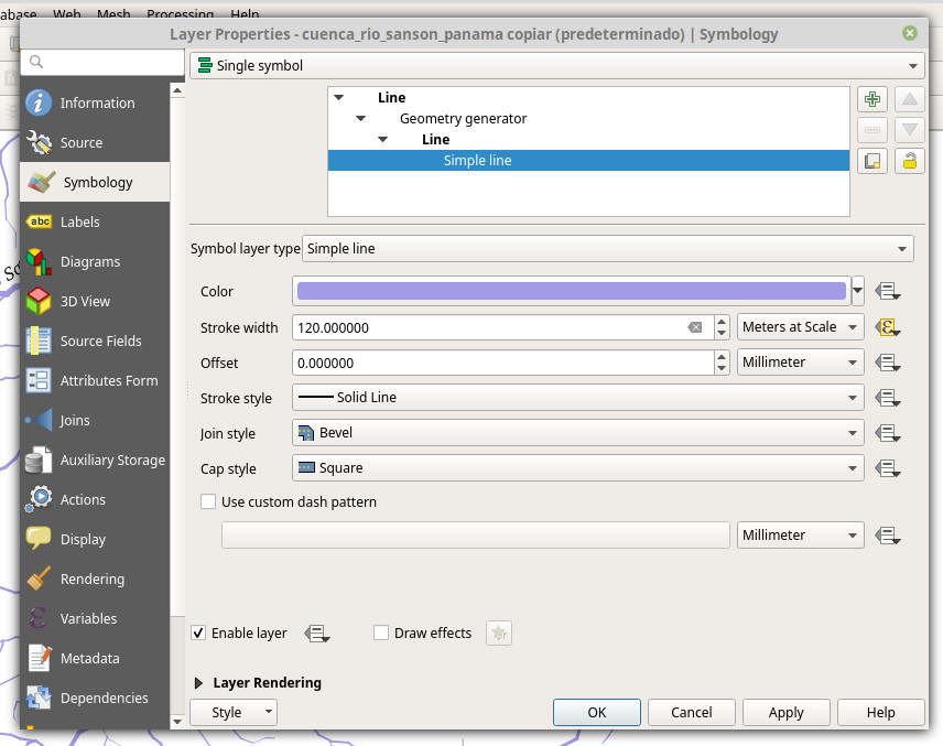 In the Stroke width field, select Meters at scale (this is what I used here, you can also use milimeters or whatever you want). The actual width in the text box here makes no difference, as we will generate it as follows. Click on Data defined override (the icon on the right side) and choose Edit....
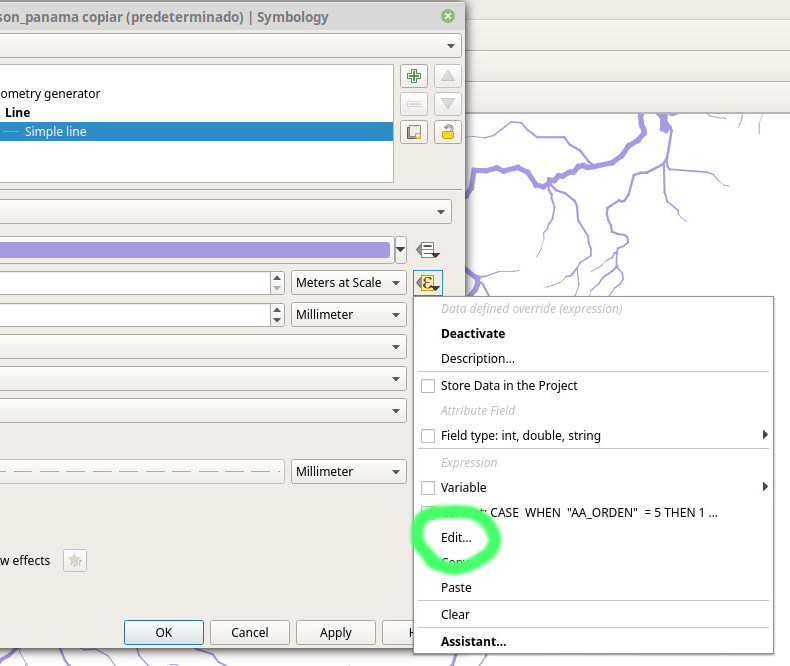 In the Expression string builder dialog that appears, copy the following code:
 CASE
 WHEN "AA_ORDEN"  = 5 THEN 1
 WHEN "AA_ORDEN"  = 4 THEN 2
 WHEN "AA_ORDEN"  = 3 THEN 3
 WHEN "AA_ORDEN"  = 2 THEN 3.5
 WHEN "AA_ORDEN"  = 1 THEN 5
 ELSE 10
 END
 * (  log10(@geometry_part_num) /  log10(@geometry_part_count) )
 * log10($length)
 * 3
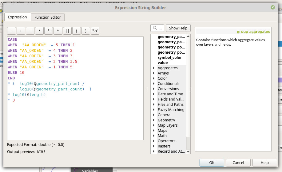
Let's take a look at the code. Your stream rank column, the one I describe in point 3 above, is the one I've called "AA_ORDEN". Replace this in the code here with the name of your rank column. The number that follows, ( = 5, = 4 etc) is the classifier you used for your streams, from the smallest creek (5) to the largest rivers (0, the zero is not shown because it is selected by the ELSE). Put here whatever you used to rank your streams (for example, = 'big river' or = 'tiny stream').
The numbers after THEN (1, 2, 3, 3.5, 5 and the 10 in the ELSE) represent the width of your line. Since we chose Meters at scale before, this number is the width of your river in meters. You can adjust these figures according to the real width of streams of to how they look better. If you used millimeters, these values would be different.
The following section of the code does the magic of the tapered rivers. It uses the expressions @geometry_part_num, @geometry_part_count and $length to asign progressively thicker values to each segment of your line, making it wider the longer your line is.I've used a logarithmic function (log10) so that width increases rapidly at the beginning of the stream and then increases more slowly. It seems to me longer rivers look better this way. You can change this part of the code and use * ( @geometry_part_num / @geometry_part_count )
if you prefer your lines to become wider more gradually. Try both options to see which one you like better.
The last section, * 3, is an additional factor you can use if you want all of your rivers to be wider (multiply by a number larger than 1) or thinner (less than 1, like 0.5, for example). This factor and the width values are something you want to adjust by trial and error.
Check here the final result in high resolution.
This method requires a bit more work preparing your dataset and then time to adjust the width values in the expression. But the result is worth it and your map will look much better. Share your modifications to this method and your resulting maps leaving a comment below, on Twitter or Reddit, I'd love to hear your thoughts and ideas.
Comments
Comments are moderated before they are published.
You can also comment on Twitter or Reddit